
Responsive Web Design: Everything You Need To Know
Ever visited a website on your phone that looked like a miniaturised version of the desktop site? Frustrating, right? You end up pinching and zooming just to read the text or click a button. That’s exactly what responsive web design aims to fix. If you’re running a business with an online presence (and let’s face it, who isn’t these days?), understanding responsive design isn’t just nice to have—it’s absolutely essential.
What is Responsive Web Design?
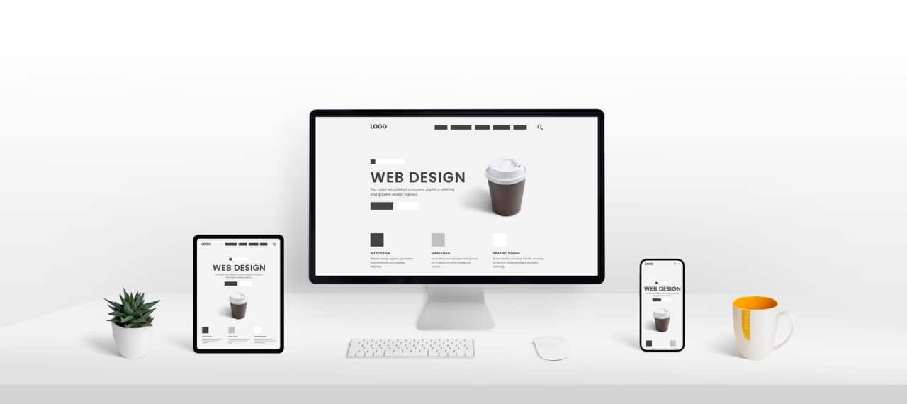
In simple terms, responsive web design is an approach that makes your website look good and work well on any device—whether it’s a desktop computer, tablet, or smartphone. Instead of creating separate websites for different screen sizes, you build one flexible site that automatically adjusts its layout based on the device being used.
Think of it like water—it takes the shape of whatever container it’s poured into. Your website content should flow just as smoothly, regardless of the screen it’s viewed on. This adaptability is what makes responsive design so powerful in today’s multi-device world.
How Responsive Web Design Works
The magic behind responsive design boils down to a few key technical components. At its core, it relies on flexible grids, flexible images, and CSS media queries.
The layout is built using relative units like percentages rather than fixed units like pixels. This means elements on the page will resize proportionally to the screen. Media queries then detect the visitor’s screen size and orientation, triggering different CSS styles for different situations.
When implemented correctly through our web development services, these elements work together to create a seamless experience across all devices without requiring separate websites or redirects.
Key Benefits of Responsive Web Design
The advantages of going responsive extend far beyond just looking good on mobile. Here’s why it matters for your business.
Better User Experience
Let’s be honest—user expectations are higher than ever. When someone visits your site on their phone, they expect it to work just as well as on a desktop. Responsive design delivers this consistency, keeping visitors engaged rather than frustrated. Happy users are more likely to stay longer, explore more pages, and eventually convert.
Improved SEO
Google loves responsive websites. So much so that they actually use mobile-friendliness as a ranking factor. With a responsive design, you maintain a single URL for each page, which concentrates your SEO efforts and avoids the duplicate content issues that come with separate mobile sites. This translates to better visibility in search results and potentially more traffic.
Cost-Effective and Time-Efficient
Maintaining one responsive website is significantly cheaper than managing separate desktop and mobile versions. You’re updating content in one place, fixing bugs on one platform, and running analytics on a single property. For businesses watching their bottom line (and who isn’t?), this efficiency makes responsive design a no-brainer.
Increased Mobile Traffic
Mobile internet usage continues to climb year after year. In many industries, mobile traffic has already surpassed desktop. A responsive site ensures you’re not turning away this massive audience with a poor mobile experience. You’re meeting users where they are—on their phones and tablets—with an experience tailored to their device.
How Responsive Web Design Improves User Experience
User experience isn’t just a buzzword—it directly impacts your bottom line. Here’s how responsive design makes things better for your visitors.
Seamless Navigation Across Devices
When choosing the right ux design agency, look for one that understands how navigation should adapt across devices. On mobile, space is limited, so menus need to be condensed (often into the familiar “hamburger” icon). Yet the navigation still needs to be intuitive and easy to use, regardless of how it’s presented.
A well-executed responsive design ensures users can find what they’re looking for without frustration, whether they’re on a 27-inch monitor or a 5-inch phone screen.
Faster Load Times
Speed matters—a lot. Research shows that 53% of mobile users abandon sites that take longer than three seconds to load. Responsive design, when properly implemented, helps optimise load times by serving appropriately-sized images and streamlined code.
Rather than downloading desktop-sized images and scaling them down (wasting bandwidth), a responsive site delivers images sized appropriately for each device, significantly improving load times on mobile connections.
Consistent Branding and Design
Your brand identity should remain consistent regardless of where customers encounter it. Responsive design ensures your visual identity, tone, and user experience remain cohesive across all devices, strengthening brand recognition and trust.
This consistency isn’t just about aesthetics—it’s about creating a reliable experience that users can count on every time they interact with your business online.
Best Practices for Implementing Responsive Web Design
Ready to make your website responsive? Here are the key principles to follow.
Use Fluid Grid Layouts
Ditch the pixel-perfect mentality. Modern responsive design relies on flexible grids based on percentages rather than fixed pixel widths. This allows content to resize proportionally to the screen, maintaining proper spacing and alignment regardless of device size.
Think of your layout as a series of containers that expand and contract as needed, rather than rigid boxes fixed to specific dimensions.
Media Queries
Media queries are CSS superpowers that detect the characteristics of a user’s device—screen size, resolution, orientation, and more. They allow you to apply different styles based on these conditions.
For example, you might use a media query to change a three-column layout on desktop to a single column on mobile, or to increase font size on higher resolution screens for better readability.
Optimise Images for Different Screen Sizes
Images often make up the bulk of a webpage’s file size. To improve performance, implement responsive images that serve different sizes based on the user’s device. There’s no point loading a 2000px wide hero image on a 375px wide phone screen—it wastes bandwidth and slows down the site.
Modern solutions like the srcset attribute and picture element make it easy to serve the right image for the right screen.
Mobile-First Design
Start by designing for the smallest screen first, then progressively enhance the experience for larger screens. This “mobile-first” approach forces you to focus on the essential content and functionality from the beginning, resulting in more streamlined experiences across all devices.
It’s much easier to add complexity for larger screens than to remove it for smaller ones. Plus, it aligns with Google’s mobile-first indexing approach to SEO.
Common Challenges in Responsive Web Design

Despite its benefits, responsive design does come with some challenges to overcome.
Cross-Browser Compatibility
Different browsers interpret code differently, and this variation becomes even more pronounced across devices. Testing across browsers like Chrome, Safari, Firefox, and Edge—on both desktop and mobile—is essential to ensure consistent experiences.
Browser-specific bugs can be frustrating, but they’re solvable with careful testing and CSS fallbacks for older browsers.
Performance Issues
Poorly implemented responsive design can actually hurt performance if not optimised correctly. Large images, unnecessary JavaScript, and bloated CSS can all contribute to slow load times, especially on mobile networks.
The key is to build with performance in mind from the start, using techniques like lazy loading, code splitting, and proper image optimisation.
Testing and Debugging
With countless screen sizes and device types available, thorough testing becomes both important and challenging. What works perfectly on an iPhone might break on an Android tablet, or vice versa.
Establish a testing protocol that covers a representative sample of devices your audience uses, focusing on the most common screen sizes and operating systems.
How to Test Your Responsive Web Design
No responsive website should launch without thorough testing. Here’s how to make sure yours works flawlessly across devices.
Use Device Emulators
Browser developer tools like Chrome DevTools include device emulation features that simulate various screen sizes and devices. This is a quick way to test how your design adapts across different viewports without needing physical devices.
While not a replacement for testing on actual hardware, emulators provide a good first pass at identifying major responsive issues.
Manual Testing on Real Devices
Nothing beats testing on actual physical devices. If possible, maintain a small collection of common devices—perhaps an iPhone, an Android phone, an iPad, and a few different desktop monitors—to verify your designs work as expected in real-world conditions.
Pay special attention to touch interactions, which can’t be fully simulated with a mouse and keyboard.
Automated Testing Tools
Tools like Browserstack, Responsinator, and Lambdatest allow you to test your site across hundreds of device and browser combinations without needing the physical hardware. These services can be invaluable for catching edge cases and ensuring broad compatibility.
Automated visual regression testing can also help identify when changes to your code unexpectedly break the responsive layout.
Final Thoughts
Responsive web design isn’t just a trend—it’s the standard approach for building websites in today’s multi-device world. When done right, it creates seamless experiences that delight users regardless of how they access your site.
Remember that responsive design is more than just making things fit on different screens. It’s about creating truly device-agnostic experiences that put user needs first. By embracing flexibility in your designs and following best practices, you’ll create websites that stand the test of time—and technology.
Ready to make your website responsive? We’d love to help you create a site that looks and works brilliantly across all devices. Get in touch today to discuss your project!
