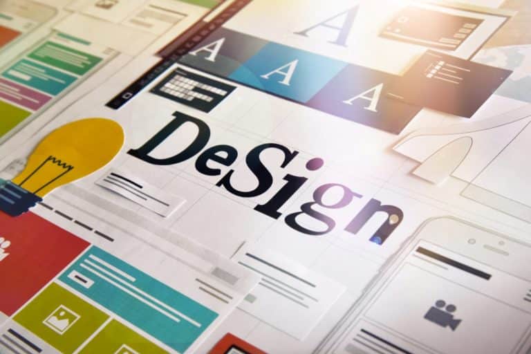
UI Design Trends 2025/26
What’s Evolving, What’s Overhyped
Let’s skip the obvious: yes, design evolves. Yes, users are more demanding. No, your product doesn’t need to look like Apple’s landing page to feel modern.
But in 2025 and beyond, it’s becoming harder to separate design that’s actually helpful from design that just looks good in a Dribbble shot. So here’s the reality, not from a trend forecaster, but from someone who’s spent years working on real web and app products.
Below are the UI trends we see shaping smart digital products right now, and the ones we’ll be using, or deliberately ignoring, in the projects we design and ship.
Interfaces That Talk Back, But Know When to Shut Up
Interaction design is no longer about flashy buttons or satisfying toggles. It is about interfaces that feel aware of the user, like they’re reacting with purpose, not just style.
Microinteractions still matter, but they’ve grown up. They’re not gimmicks anymore, they’re how modern UIs communicate. Did the system understand your tap? Is something loading? Has the state changed? Animation now acts like tone of voice, subtle, contextual, and still a little charming when done right.
There is also the rise of voice and chat interfaces, often layered over traditional UI. These aren’t just for AI tools, even finance and B2B platforms are building conversational elements into their workflows. The catch, if your chatbot just repeats the same CTA three times in a circle, it is not clever, it is bad UX wrapped in a trendy wrapper.
We are helping clients design interactive layers that make sense, contextual hints, flexible input methods, smart defaults. Because interaction is not just what happens after you click, it is what guides you to the click in the first place.
See our UX, UI design services and how we embed design into real web applications.
Layouts That Stop Pretending to Be Minimal
Minimalism had a good run. Now the best interfaces aren’t minimal, they’re intentional.
2025’s UI is shifting toward layouts that do more than “look clean”. Think bolder grid systems, clear content hierarchy, and purposeful spacing, especially in SaaS dashboards, onboarding flows, and long form content pages. A white background and thin font is not a design system. It is a default.
Designers are also rediscovering visual weight, using contrast, layering, and typography to direct attention instead of hiding it. Accessibility is not a checkbox anymore, it is a design tool.
We’re seeing more interfaces embrace modular layouts, smart cards, and scroll triggered dynamic sections. Why, because apps aren’t static. Users need context, not whitespace.
Looking to evolve your platform, talk to us about custom web development and how we size a project inside services.
When Texture Returns, But Doesn’t Take Over
Flat design did not die, it just got a little less flat. Designers are bringing back a sense of material in subtle ways, shadows with intent, translucent layers, textured backgrounds that do not scream “Photoshop 2008”.
We are not talking full skeuomorphism, nobody needs stitched leather navbars again, but the pendulum is swinging toward designs that feel a bit more tactile. Not because it looks cooler, but because it helps users orient themselves in a digital space.
Done right, depth and detail signal interactivity. Done wrong, it is just noise. We aim for the first one, starting with a proper design system and component rules that scale across complex web applications.
AI Is Changing the Interface, Quietly
The real AI trend in design is not the chatbot, it is personalization.
Modern UIs are starting to shift based on the individual. Dashboards reorder. Product lists surface different results. Settings get smarter, and all of it feels native because the interface does not say “Hey, I’m AI”, it just works better.
Design systems are evolving to accommodate this, more conditional components, dynamic layouts, adaptive copy blocks. For product teams, this means thinking beyond static Figma frames and building modularity into everything.
If you are designing a new product or rebuilding an old one, do not ask “where can we use AI”, ask “where would it make this easier for the user”, then design around that.
We’ve baked this thinking into recent app development projects, especially where web applications serve different user roles with different journeys.
Trend ≠ Good. Trend + Context = Great.
Here is the truth no trend report wants to say out loud, most trends are not worth copying. What works for a fashion brand homepage probably will not work for a fintech dashboard.
The smartest product teams in 2025 are not following trends, they are reading them like signals. They choose the ones that serve their users and ignore the rest.
You do not need a glassmorphic navbar because Apple did it. You need clarity. Flow. Friction where it matters. Surprise where it delights. That is what modern UI really is.
If you are wondering which of these trends are worth exploring in your product, and which to leave for someone else’s portfolio piece, we are happy to help.
And contact us, if you need an agency partner on the ground, see our app development agency in London.